Friendly Neighbor
Winter 2022-2023 | Chicago, IL
Friendly Neighbor is a local community support nonprofit that partners with local charities and organizations to assist with donations and serving neighbors in need. This case study explores building a website and a mobile app and the similarities and differences between these two types of interfaces. The main user journey for the mobile app is to schedule a donation time while the user journey for the website is to submit a partnership application.
Goal Statement
To build a mobile app and accompanying website while maintaining company brand and placing focus on different user experiences.
Project Overview
Though the user may reach the same goal using the app as they would on the website, each platform has a different user journey focus. A mobile app needs to allow users to schedule and submit donations while on the go. The website is used more for reference and business communications, while also allowing the user to submit an application for partnership opportunities. My role as the UX Designer was to research two seperate user journeys on seperate platforms, build wireframes, and design LoFi Prototypes. Mockups were then created for the app and website, then later developed into HiFi Prototypes before handing off the project.


Understanding the User - Empathize and Define
Personas were created from interviews conducted with potential users. From the interviews, one persona was created for the user journey on the mobile app, while another was used for the responsive website. Ms. Navarro is needing to partner with a local organization to help collect and distribute the collections her church receives. Sven is a father of two and has a busy work schedule. His focus is to schedule a donation time while commuting to work.
A Problem Statement helped establish goals, constraints, define deliverables, and make benchmarks for success. After personas were created, I mapped out a user journey to be used with laying out the structure of the mobile app.

Ms. Navarro is an administrative director for a local church who needs assistance organizing donations because the church receives many donations and require assistance for distribution to those in need.

Sven is a busy father and nurse who needs to schedule Times to donate used clothes because he notices the need for donations while on his daily commutes.

When both Problem Statements had become clear, I began early design stages for the mobile app and website using a Site Map.

Beginning the Design Stage - Ideate
Crazy 8 exercise helped explore different scenarios the mobile app and website could be used for.

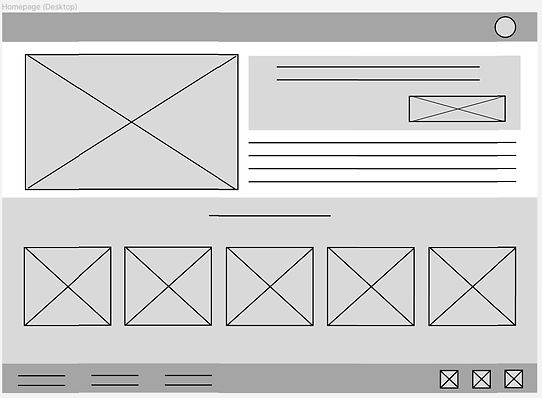
Once I've gathered my data and listed out elements I'll need to include on the mobile app and website, I began creating Paper Wireframes. This allowed me to quickly sketch out ideas for how the app and website will look. After creating the paper wireframes, I transferred them onto Figma. As the user journeys were laid out on the mobile app and website, I also designed the homepage for the website on a Tablet and Desktop sized screens.


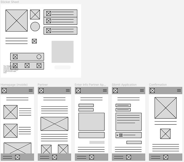
Digital Wireframe of Mobile app

Digital Wireframe of Website on Mobile Phone, Tablet, and Desktop.

Wireframes updated to Low Fidelity Prototypes
After refining the wireframes, I developed Low Fidelity Prototypes for the mobile app and website. These allowed me to conduct more testing with my design and begin to see how my product could look and feel. As a reminder, the user journey for the mobile app is to schedule a time to donate items while the user journey for the website is to submit an application for a partnership with the organization.
LoFi Prototype of Mobile App

LoFi Prototype of Website on Mobile Phone

Usability Testing and Mockups
Results of an unmoderated usability study showed a few opportunities of improvement for the design which led to a second version of the mobile app LoFi Prototype. For most users, it's not clear how they should list their donations and the ability to edit their donated items list before submitting. From these themes, I pulled a few insights that helped push the LoFi Prototype of the mobile app. The updates included providing users an easier way to list their donations, the ability to edit their list, and choose how their donation will be delivered to the donation center.
Donation Selection Before Usability Study

Donation Selection After Usability Study
A list provided users a quick way to describe their donated items.

The first option now allows the user to decide if they want to drop off or have someone pick up their donations
Low Fidelity Prototype
Version 2

After updating the LoFi Prototype of the mobile App, I added iconography and color while finalizing fonts to create the Mockups for each platform.
Mobile App Mockups

Website Mockups

High Fidelity Prototype
After implementing design changes backed by my findings in the usability study, I added animation to the mobile app and website's mockups. By continuing to refine and edit the mockups, I was able to move to High Fidelity Prototypes and prepare to hand them off to the engineer team.
With a large donation button located in the bottom right of the mobile app's homepage, the user can easily find the section to schedule a donation. The website focuses more on community and event planning where the section to submit a partnership application can be navigated to quickly.

HiFi Prototype of Mobile App

HiFi Prototype of Website on Mobile Phone
Takeaways
After exploring both Figma and Adobe XD, I find myself leaning towards Figma at this point of my career. Though that's not without saying Adobe XD felt more at home to me, given that several shortcuts or hotkeys remain similar across several Adobe products - though I do miss the "Copy to Replace" feature in Figma! I found my experience with Illustrator, Photoshop and InDesign helped me pick up XD much quicker than I was expecting.
Both programs are joy to use and I love gathering feedback and research insights to push my designs further and further. Closing out this third case study excites me for the future of UX and enforces my motivation to work with animation and motion graphics. Throughout each design sprint for my case studies, I have to say I enjoyed prototyping the most. These stages allow me to see my ideas come to life and ramp up my design thinking.