
A Few Keys Below
Fall 2022 | Chicago, IL
A case study for developing a mobile website. A Few Keys Below is a fictional bar that is one part piano lounge, one part speakeasy. The main user journey is to reserve a table using the reservation feature on the site.
Goal Statement
Our piano lounge mobile site will let users access our website via mobile devices which will affect people who do not have access to a desktop or laptop by providing more ways to access our company's information and interact with our business. We will measure effectiveness by how many site visits we received and table reservations made compared to the desktop site.
Project Overview
Currently, A Few Keys Below only has a working desktop site and has noticed a lack of interactions from users. They wish to launch a mobile version of their site in hopes of reaching more potential customers (anyone age 21 and up). As a UX designer, my role is to create a mobile website that offers the same information and features that are present on their desktop site while ensuring users can complete the user journey with as little difficulties as possible.


Understanding the User - Empathize and Define
Personas were created after interviewing users to create Empathy Maps and identify User Pain Points. These results are represented as two Personas that reflect users who may wish to reserve a table at A Few Keys Below. Kel and Steph were used to create Storyboards and User Journey Maps and a Competitive Audit was summarized in an audit report.

Kel's User Story
"As an attorney I want to have a place where I can meet with clients at various times so that I can build a stronger relationship with them and conduct work outside my office."

Steph's User Story
"As an upcoming journalist I want to research local music venues and meet musicians so that I can provide more accurate research for
my articles."

A Close-Up Storyboard for a mobile website to allow users a way to reserve a table at A Few Keys Below while on the go.
A Big Picture storyboard showing a user on the go and reserving a table.


A User Journey Map conveys the steps taken by the user, their emotions completing the task, and possible areas of improvement.


A Competitive Audit and Audit Report gave me an overview of what our competitors did correct and areas where we noticed opportunities for our own designs.
Beginning the Design Stage - Ideate
The design started with paper wireframes that were then converted into digital wireframes using Figma.


Wireframes updated to Low Fidelity Prototypes
Once the Wireframes had been finalized, page transitions were added to create LoFi Prototype of the mobile site and simulate basic functions of the user journey.

Usability Testing and Mockups
After completing the LoFi Prototype, it was necessary to test the design on real users. An Unmoderated Usability Study lasting 20 minutes for each of the 5 participants helped answer several research questions, including; Are there any pages users need quick access to throughout the reservation process? and Are there any sections that give users issues throughout the user journey?
From the study's results, the Usability Study Report produced three Themes that were used to create Insights. These insights were implemented to the LoFi Prototype to generate Mockups of the design.


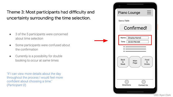
Insights offered opportunities to improve on the design and provided real data to back design choices made in the Mockup.


Mockups also included the use of color, iconography, and other elements to form a Design System to be used in the following stages of designing the mobile site. Within the Design System, I also created a Button Sheet to speed up my design flow and avoid creating pages or regions of the site from scratch.

High Fidelity Prototype - Version 1
After the Mockup was completed, animated page transitions were used to create the HiFi Prototype of the mobile site.
High Fidelity Prototype - Version 2
After the main user journey was created in a HiFi Prototype, additional pages were added to the mobile website. An expanded events calendar, food and drink menu, Contact Us page, and accessibility features were added to created the second version of the prototype.

Takeaways
This case study was my first project for the Google UX Design Certificate. It was also my introductory to Figma and had lots of fun learning the program and exploring what all it could do. I had noticed my knowledge of Adobe programs helped when learning Figma, as there are similarities between the two.
I've also increased my knowledge of user-backed data and how these insights from watching users interact with my design can lead to improvements and opportunities to push my own design work to new levels. All in all it was a great introductory project for the world of UX/UI and loved every minute of it.
Looking forward I plan to learn more features of Figma, especially creating components and using instances to quickly edit sections of a file at one time. The versatility of Figma has me excited about the idea of working with other designers on one project at the same time.
